No. 204
Design + Planning Application
lvp architects were appointed to work on a ‘quirky’ residential project to help reorganise and thermally improve a family semi-detached home with a design solution that would create a more harmonious home - internally and externally.
It began with assessing the family's current and long-term needs and reviewing the existing dwelling in its present layout, which had been a disjointed evolution of adaption and extension(s) by the previous owner.

No.204 is a semi-detached ‘quirky’ property within a street that consists of semi-dwellings of a variety of brick and render design
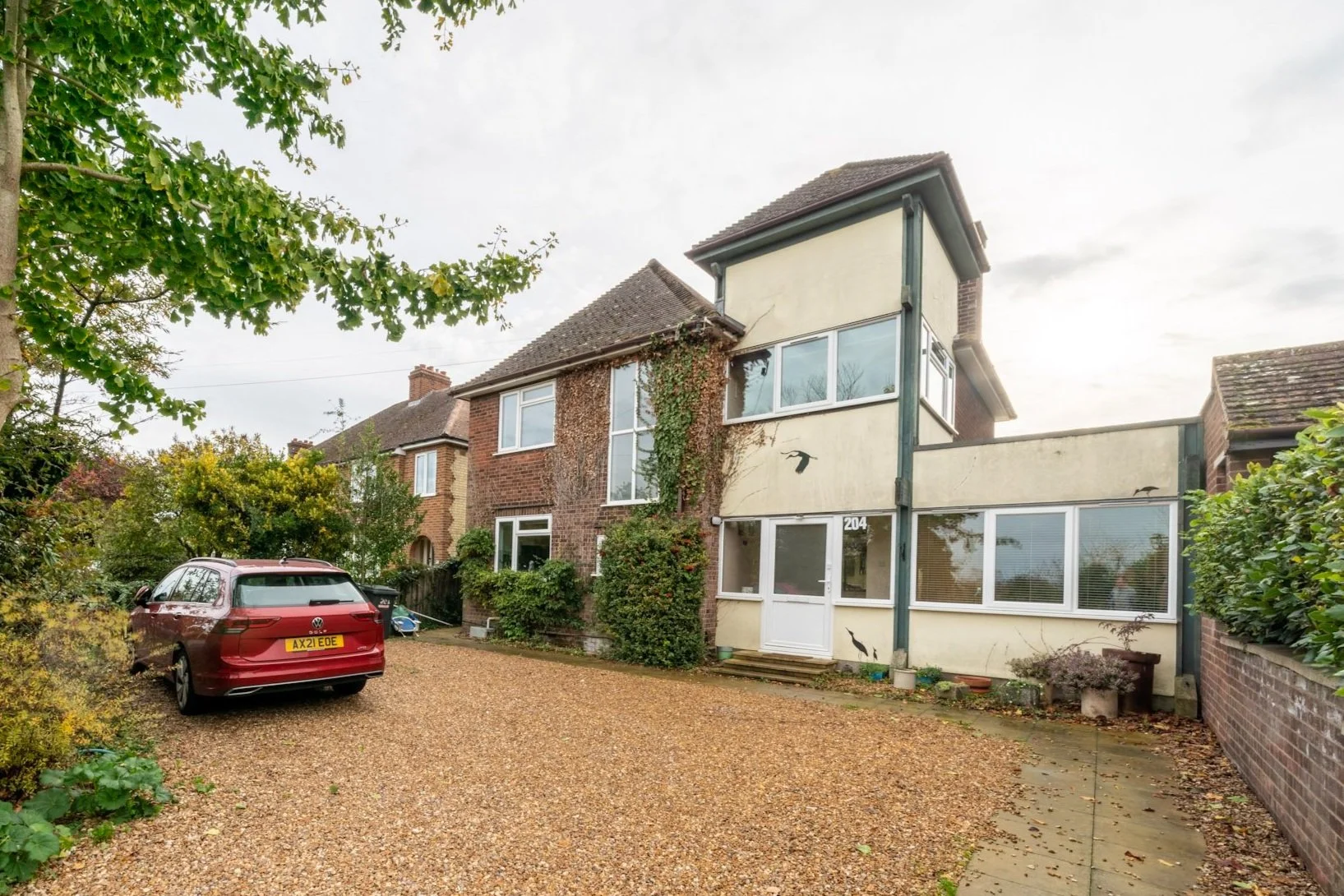
It became apparent that though it was a house with quirkiness, it suffered from a lack of clear identity externally and a very convoluted and obstructive interior layout of spaces.

While the ground floor is convoluted, the first floor was suitable for the way the family wished to live, providing sufficient bedrooms just lacking an ensuite to the master bedroom.

PROPOSED LAYOUT
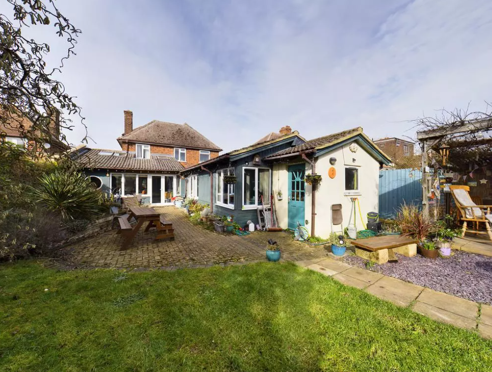
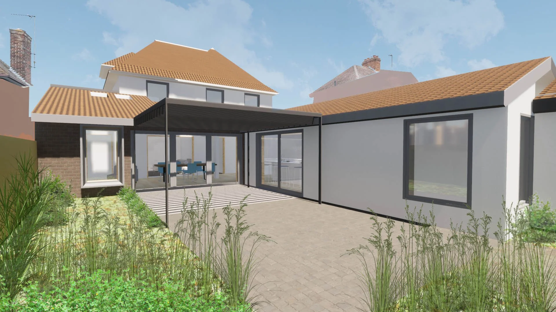
The principle was for the kitchen and dining space to be relocated to the rear of the ground floor, looking out over the new landscaped long garden and through the new external covered entertaining space. It needed to connect the kitchen, dining space, and garden and also be central enough that you could access all other parts of the home directly from it.
By opening up and reconfiguring the old garden room and annexe, and creating a new entrance route, a unified and practical layout was created.

EXTERNAL MATERIALS
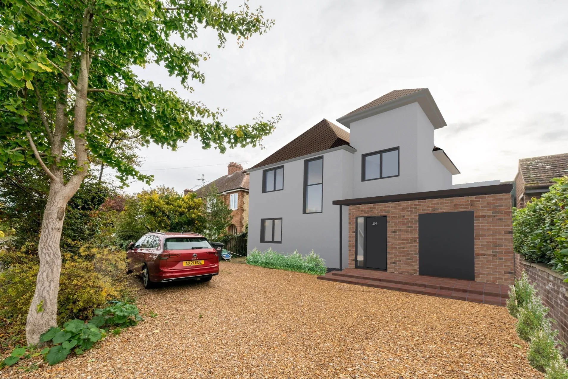
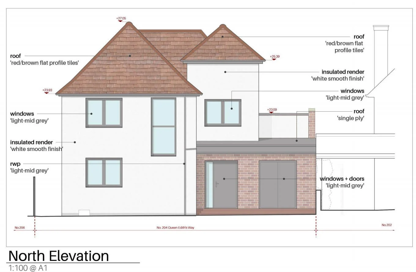
The existing streetscape is a mixture of brick and render or varying colours. By using these two materials it was possible to create a more unified and looking home.
The existing house and turret is to be clad in an off-white smooth render, with replacement mid-grey frame-coloured windows and reveals
The design then focused on contrasting that rendered element with a single-storey brick-clad element, which helped strengthen and define the ‘front door’, which until then had been lost in its original aesthetic confusion and odd visual split apperance.


Material Board



off-white render
mid grey frames, trims + rwp’s
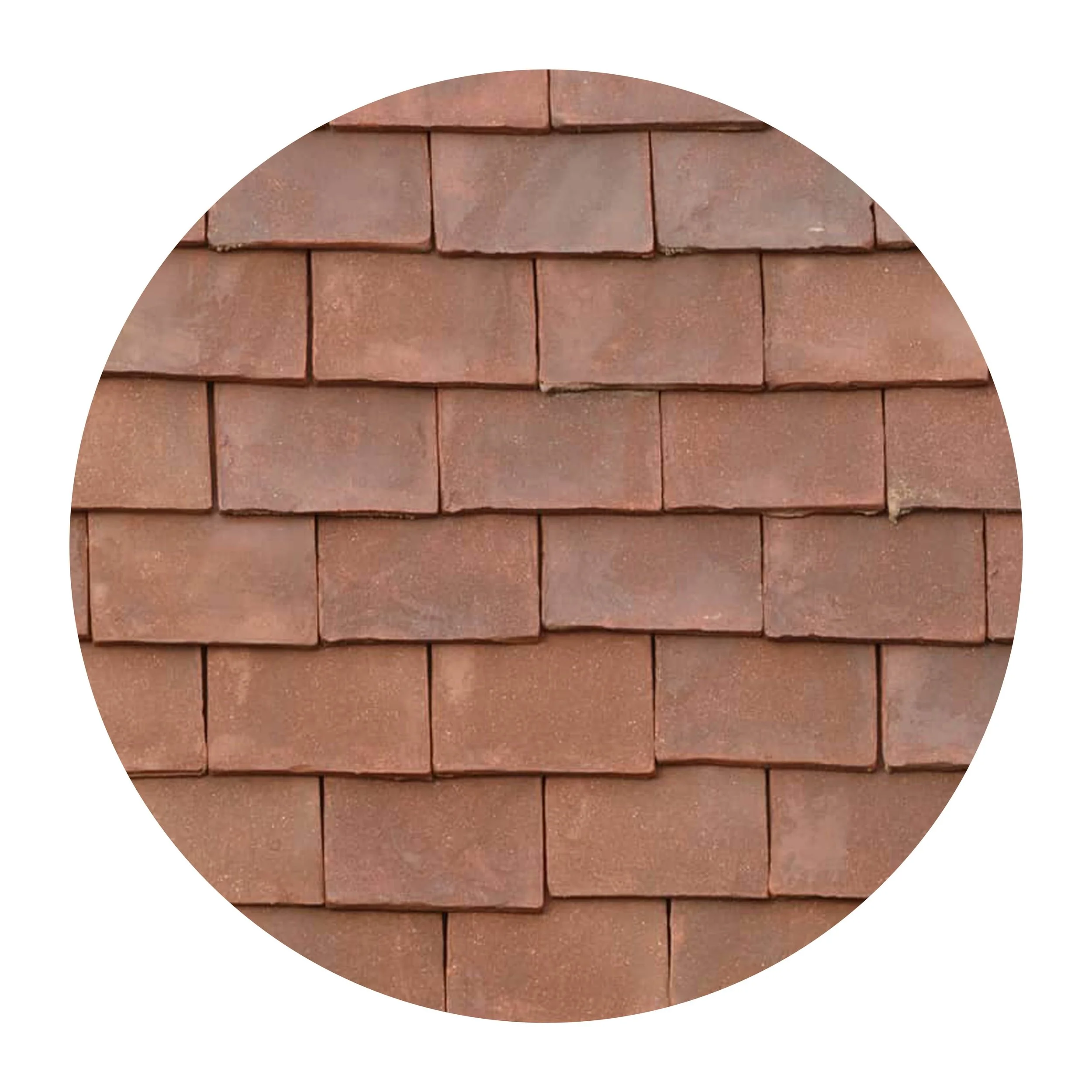
red/brown roof tiles
red/brown brick
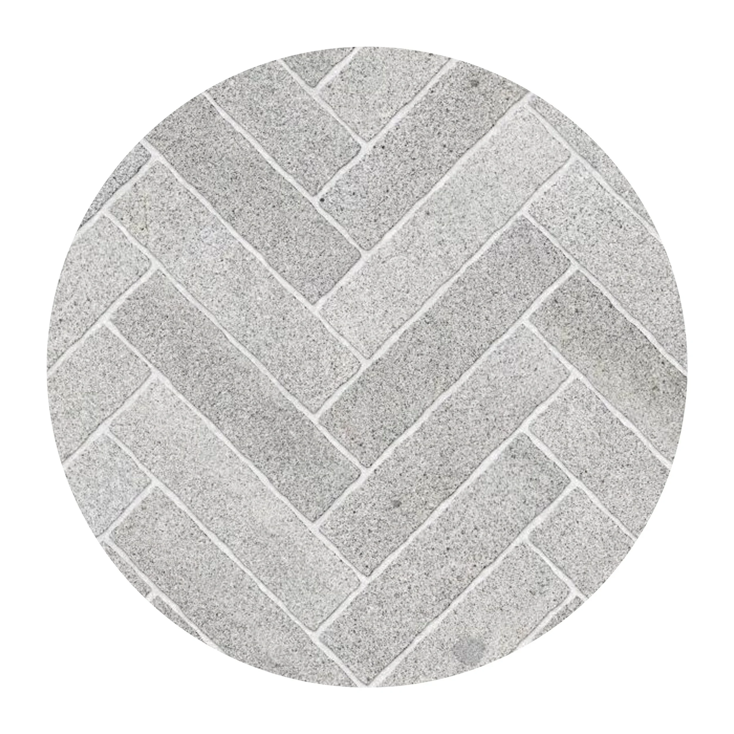
hard landscape
